💅 Refurbishing the UI
Bettertori just became better.
What’s changed?
Bettertori is getting a major UI upgrade, with improved user experience. The new UI is designed to be more intuitive and user-friendly, making it easier to navigate and find the information you need.
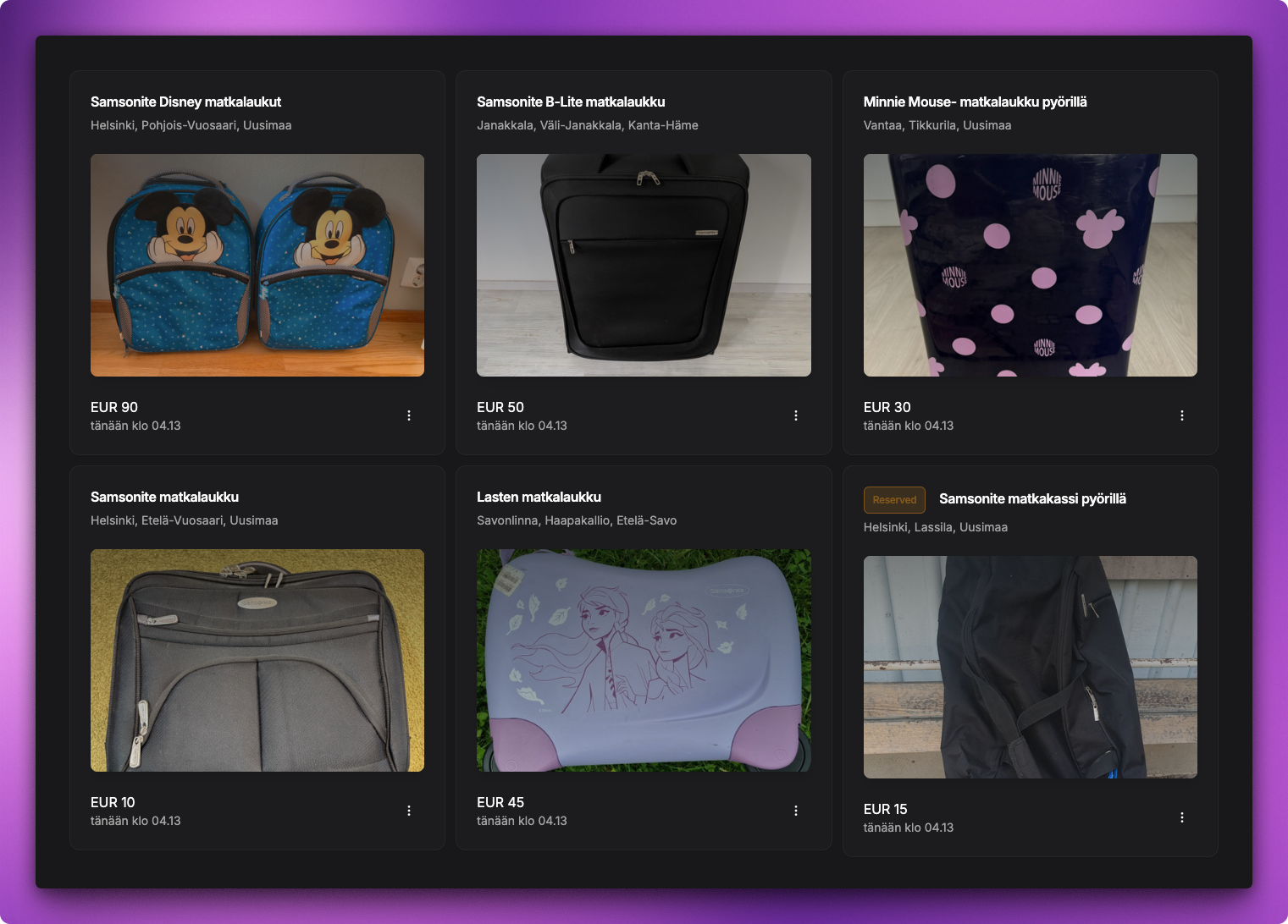
Better listing view
The listing view has been completely redesigned to provide a more modern and clean look. The new design features a more compact layout, with larger images and more information about each item. This makes it easier to browse through the listings.
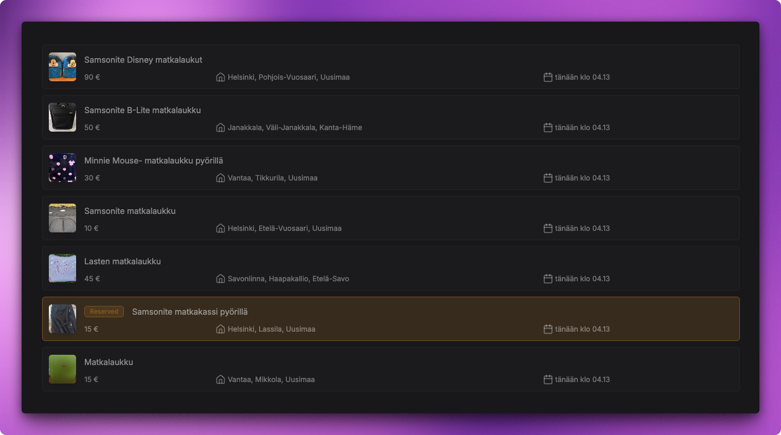
In the initial version of Bettertori, the listing view was not a good design. It was cluttered, and the information was not presented in a clear and concise way. The new design addresses these issues by providing a more organized and visually appealing layout.
I mean just look at the difference!
Better data visualization
The list of good news does not end there. The latest updates also brings some enhanced data visualization features, which helps presenting the available data in a way, that support making better decisions. Also, besides upgrading some of the existing charts, there is also a couple of new ones!
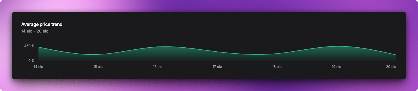
Supply and Demand Chart
When it comes to find stuff to buy, especially on a second-hand marketplace, the supply and demand is a key factor. The new supply and demand chart provides a visual representation of the supply and demand for each of the watched categories, making it easier to see which items are in high demand and which items are in low supply, at any given time.
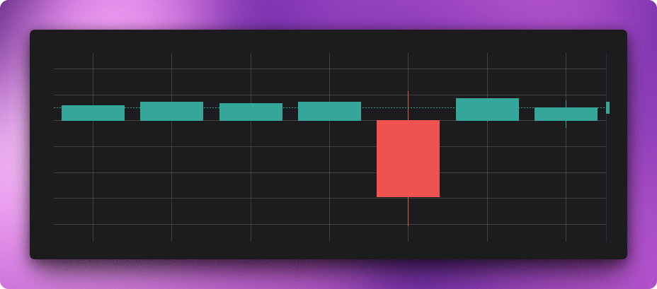
This chart shows two perspectives on product sales within a specific category: the volume of items sold and their average selling price, plotted together over time. The bars represent the daily count of sold items, giving a sense of demand and sales activity on each day. The line represents the average price at which items were sold on that same day, highlighting how pricing trends shift relative to sales volume. Viewed together, the chart helps you quickly spot patterns—such as whether higher sales volumes coincide with lower average prices, or whether price increases affect demand. It’s essentially a supply-and-demand snapshot that makes it easier to connect pricing dynamics with customer purchasing behavior.
Isn’t that just awesome? I think it definitely is! This chart is a great way to see the trends in the market, and to make better decisions when it comes to buying items.
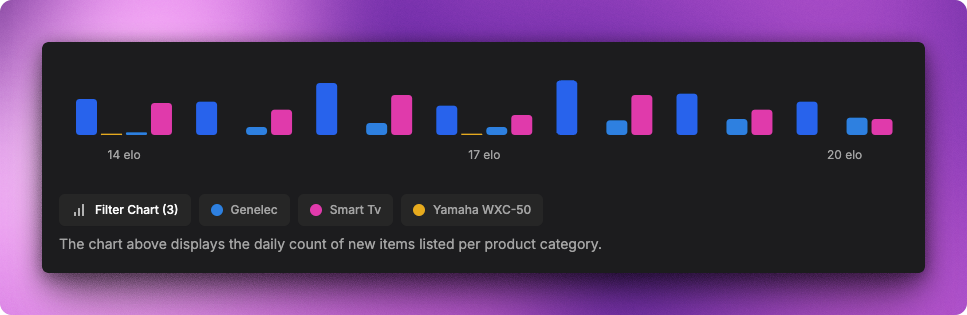
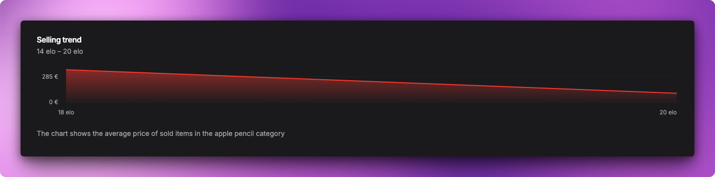
Chart of selling history
Bettertori has a clever way of keeping track of the selling of each item in each category you are receving notifications for. The selling history chart helps to visualize the data of the items sold in each category, and provides a better understanding of the market trends.
Overall revamp of the charts
The looks of a chart can have a significant impact on how the data is perceived. The latest updates bring a complete overhaul of the charts, making them more visually appealing and easier to read. The new charts are designed to be more intuitive, with better color schemes and improved layouts.